A landing page may look impressive but fail to convert because the design, color scheme, copy, and CTA aren’t optimized. This can happen more often than most marketers realize, and it’s rarely due to a single issue: rather, several small details that together impact a visitor’s decision to leave or take action.
This landing page checklist can help identify conversion barriers by walking through 15 important elements in detail, and seeing how they affect the visitor’s journey throughout the landing page. It can be applied to any type of landing page, whether it’s your first one or an established one that you’d like to refresh.
What Is a Landing Page?
Landing pages are standalone web pages that have a specific, focused purpose. While other types of web pages such as the homepage or About Us often contain various elements (navigation bar, links to different sections), these are normally focused on getting the visitor to take one specific action: to get a lead, make a sale, register for something, or download a resource.
The call to action can vary dramatically depending on the type of landing page, but the CTA is always a part of the page, and the other elements (copy, images) are designed to encourage a visitor to take it.
Landing Page Checklist: 15 Elements That Boost Conversions
Here are the 15 most important elements to check before launching or editing:
1. Clear and Compelling Headline
You only get one chance to grab a visitor’s attention with your headline. It needs to clearly state what this landing page is about and what the visitor will get from interacting with the page.
A good headline should always be customer-focused and highlight the value being offered to the visitor, not the company or service. It should always present a benefit to the customer. For example:
Bad headline: Welcome to Our Digital Marketing Agency
Good headline: Get a Free SEO Audit and Fix What’s Costing You Traffic
2. Strong Subheadline
The subheadline provides additional context or information to the headline. It can offer supporting benefits, identify a unique selling point of the offer, or highlight a potential concern (e.g., delivery time, payment method). It should not restate the headline; instead, it should complement it.
3. One Clear Conversion Goal
Having one clear CTA makes it much easier for the visitor to identify what they should do on the landing page. A competing set of CTAs (e.g., “Buy Now”, “Sign up for our newsletter”, “Follow us on social media”) will only muddy the waters and reduce conversions.
If there is a need to have multiple CTAs (e.g., one for downloading a guide and another for scheduling a call), make sure they are properly prioritized and not competing with each other.
4. Relevant and Persuasive CTA
CTAs always have to have a clear value proposition attached to them. A generic CTA such as “Submit” will have much lower conversion chances than “Get the Free Guide” or “Start Your Free Trial”.
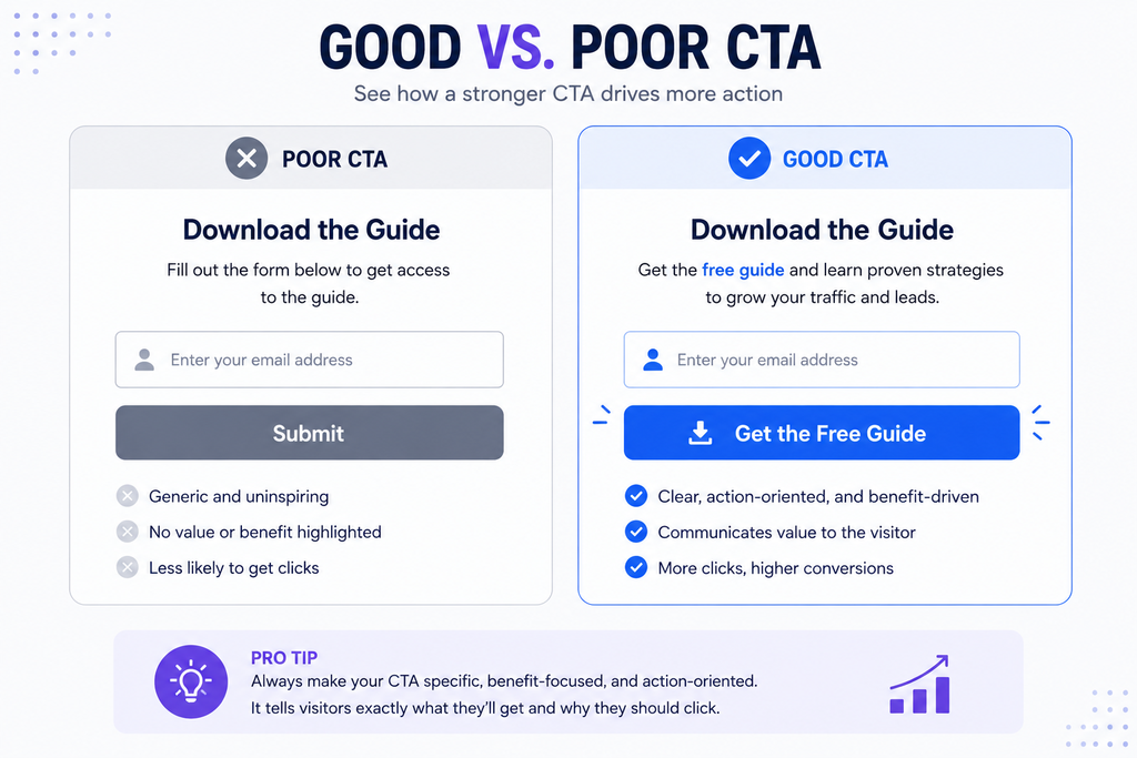
The CTA should also be prominent, placed near the top of the landing page so that it’s easy to find and access. It’s best to have one CTA near the top of the page, and another identical or similar one further down for longer landing pages.
5. Above-the-Fold Value Proposition
“Above the fold” refers to the part of a web page visible without having to scroll down. This area should always include a brief, benefit-focused summary of what the page is about, for whom it’s intended, and what the visitor should do next.
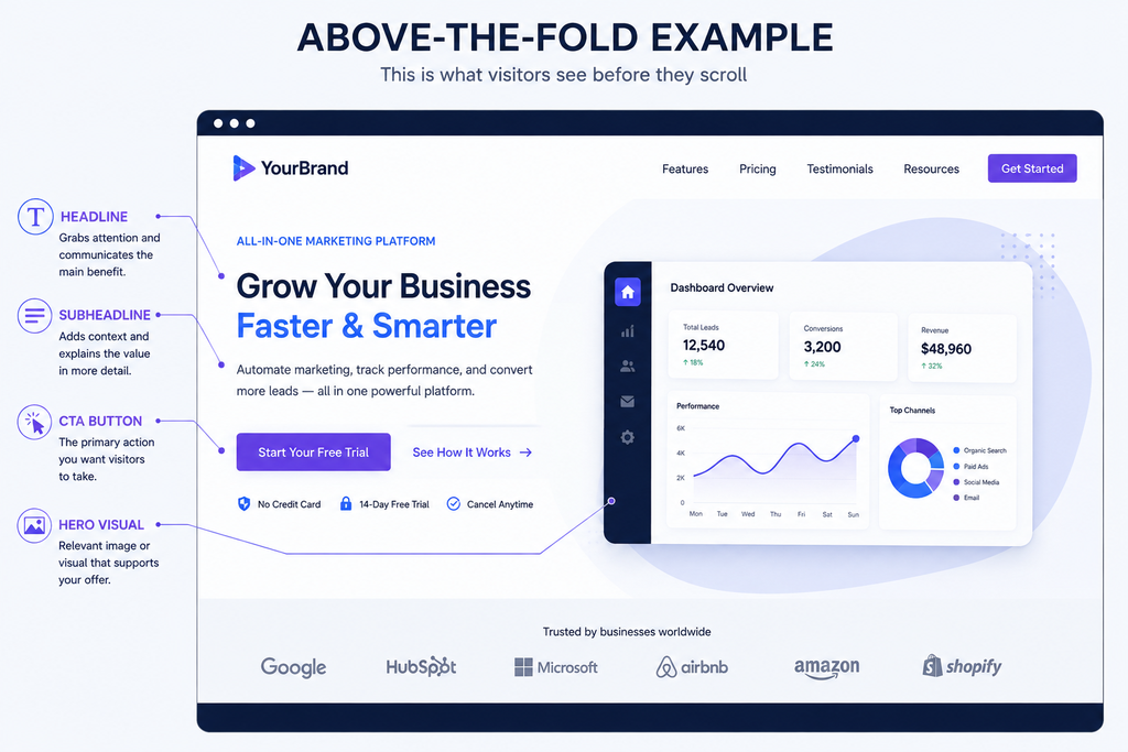
A lot of landing pages fail to deliver sufficient value above the fold, which leads to higher bounce rates.
6. Relevant Hero Image or Visual
Depending on the type of offer being presented, the hero image or visual should clearly state what the visitor can expect from the landing page. A stock image of a group of people around a laptop will have very little relevance to almost any type of offer.
Ideally, the hero image should depict the actual benefit stated in the headline. This could be a picture of a product, a customer testimonial, a short video, or any other visual.
7. Benefits-Focused Copy
While both features (characteristics of the offer) and benefits (advantages to the customer) should be included in the landing page copy, benefits should always come first. This is a matter of being customer-centric and focusing on what the customer wants and needs, not what the business wants and needs.
Feature: “Includes automated email reports”
Benefit: “Know exactly how your campaigns are performing without checking dashboards manually”
Always list benefits before features.
8. Testimonials, Reviews, and Social Proof
Most customers will be influenced by the opinions of others who have purchased the product or service. Use customer testimonials, reviews, ratings, and recognizable client logos (where appropriate) to convince the customer that you’re a trustworthy company.
Social proof dramatically reduces purchase hesitation, especially among first-time visitors who are unfamiliar with the brand.
9. Trust Signals
Along with testimonials and reviews, trust signals reassure the customer that they’re making the right choice. This category is very broad, and the right signals will depend on the type of offer and the industry: a company selling digital products online will have different trust signals from a physical store.
Some common trust signals include:
- Security badges (for websites collecting payment information)
- Refund or satisfaction guarantees
- Privacy reassurance statements (especially near forms)
- Industry-specific certifications (where relevant)
- Trust badges for accepted payment methods (for e-commerce sites)
Always make sure to only use trust signals you actually have, as fake trust badges and guarantees will damage the brand’s reputation.
10. Short and Simple Form
Every extra piece of information requested from the customer will result in a smaller percentage of completed conversions. Only ask for information that is necessary at this stage, such as first name and email for a lead magnet offer.
Avoid using unclear input fields (e.g., generic “Personal Info” instead of asking for name, age, gender), and make sure the form is mobile-friendly.
11. Mobile-Friendly Design
By 2026, most traffic in India will originate from social media and search engines, and a large percentage of that will be on mobile devices. A mobile-unfriendly landing page will have significantly worse conversion chances, because the visitor will have a frustrating experience trying to fill out a form or read the landing page content.
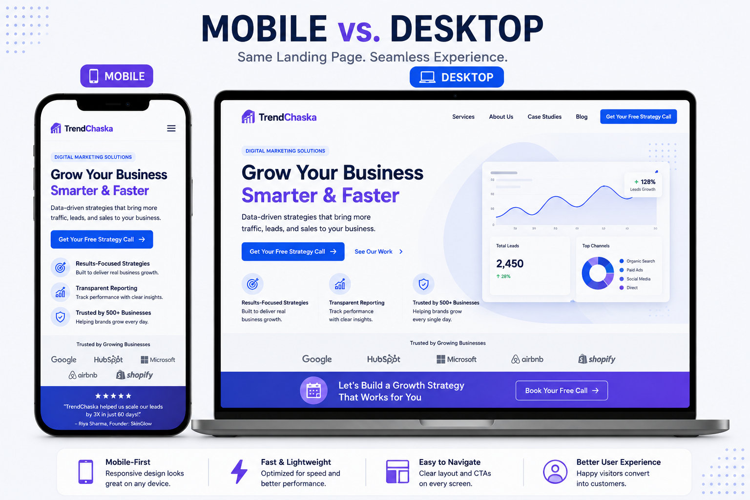
Make sure the landing page is fully responsive (adapts to different screen sizes), the buttons are large enough to tap with a finger, and the font size is also appropriate for smaller screens.
12. Fast Page Load Speed
Loading speed is one of the most important conversion factors for any web page. There are no exact statistics on how much speed impacts landing page conversions, since it varies from industry to industry, but it’s generally safe to assume that no one will wait for a slow-loading page to appear.
There are several ways to optimize the landing page’s speed, including reducing the file size of images and videos, limiting the use of external scripts (Google Analytics, social media buttons), and using reliable web hosting.
13. Minimal Distractions
Anything that takes away from the main value proposition and conversion goal will need to be removed or made less prominent. This could include the main navigation bar (for a standalone landing page), unrelated pop-up windows, animations, videos, links to other pages/offers, and other similar elements.
A focused landing page normally removes the entire navigation bar, putting the customer’s focus on the conversion goal.
14. Strong Relevance Between Ad and Landing Page
Otherwise known as the message match, this is about ensuring the ad or link the customer followed is relevant to the landing page. In other words, clicking on a Google Ad or social media post should bring the customer to a relevant landing page with similar language, headline, and value proposition.
Any differences between the ad and the landing page will contribute to higher bounce rates and reduced conversions.
15. Tracking and A/B Testing
Without analytics and conversion tracking, a marketer has no way of knowing what’s working and what’s not. Set up tracking for the most relevant metrics (conversion rate, CTA click-through rate, etc.), and use A/B testing to experiment with different elements of the landing page.
There’s no point in randomly changing one element, guessing that it will have a positive impact on conversions, and then moving on to another one. Ideally, A/B tests should always be conducted on variations of the same element (e.g., headline, CTA button, or subheadline), and minor copy edits (e.g., Book a Free Consultation vs Get My Free Consultation) can also have a measurable impact.
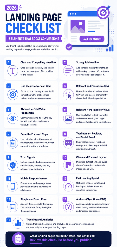
Quick Landing Page Checklist
You can always use this version as a scannable list before launching or editing a landing page:
☐ Clear headline
☐ Strong subheadline
☐ One primary conversion goal
☐ Compelling CTA
☐ Clear above-the-fold value proposition
☐ Relevant visuals
☐ Benefits-focused copy
☐ Testimonials/social proof
☐ Trust signals
☐ Simple form
☐ Mobile-friendly design
☐ Fast loading speed
☐ Minimal distractions
☐ Strong ad-to-page message match
☐ Tracking and A/B testing setup
Common Landing Page Mistakes to Avoid
- Despite years of marketers making them, several mistakes continue to appear on landing pages:
- Weak value propositions such as a generic headline or poor benefits-focused copy
- Multiple CTAs that dilute the visitor’s focus
- Too long or complicated forms that ask for too much information before offering anything of value
- Poor mobile experience, including poor usability or readability
- Slow page speed due to poorly optimized images or scripts
- Long paragraphs of text that are difficult to read or scan
- Lack of trust signals that convince the customer to invest time and/or money
- No tracking or analytics that prevent actionable insights
- Sending customers to the homepage or an unrelated landing page when they click on an ad, instead of a relevant, benefit-focused landing page
- Even fixing just two or three issues on a landing page can have a significant impact on its overall performance.
How to Use This Landing Page Checklist
You should always treat this as a cycle: analyze the elements, implement the fixes, test the changes, review the results, and repeat. Here’s a quick breakdown:
- Begin by walking through the 15 most important elements and identifying which ones need work.
- Prioritize changes based on how much impact they’ll have on the visitor’s behavior (headline, CTA, and form length normally take precedence).
- Make the necessary edits and optimizations.
- Set up tracking and review the data.
- Once the initial edits have been implemented and are delivering the expected results, consider conducting A/B tests to fine-tune your headline, CTA, or subheadline.
- It’s also a good idea to return to this checklist periodically to ensure the landing page is still performing optimally.
Final Thoughts
A high-converting landing page is less about using additional design elements and more about clearly defining the offer and removing as many barriers to conversion as possible. This checklist serves to highlight the key areas of a landing page that should always be optimized to increase the odds of a visitor converting.
Before launching or editing a landing page, always take this checklist into account. If you’re looking to save time while implementing some of the suggestions, be sure to take a look at our free digital marketing templates pack here.
FAQs About Landing Page Checklists
What is a landing page checklist?
A landing page checklist is a set of items used to review a landing page before launch or after its launch. It helps the marketer analyze the messaging, CTAs, value propositions, trust signals, mobile usability, loading speed, and other key factors to increase the chances of a visitor converting.
What are the most important elements of a landing page?
While all elements are important, optimizing the headline, CTA, and ensuring relevance between the ad and the landing page normally have the largest impact on conversion rates. Benefits-focused copy and a short, simple form also contribute to a higher conversion rate.
What makes a landing page convert better?
A benefit-focused, uncomplicated landing page without distracting elements such as a navigation bar will have a much higher conversion rate than an unfocused one. Additional trust signals such as testimonials, reviews, and guarantees also help, as will faster loading speed and mobile responsiveness.
How can I improve my landing page conversion rate?
You can always begin with this landing page checklist, go over each item in detail, and identify the weak points. Then, implement the necessary improvements and begin tracking and testing to see which tweaks have the largest impact.
Should a landing page have multiple CTAs?
While a landing page should always have one clear CTA, nothing is stopping it from including additional CTAs further down the page or beneath the primary one. Multiple CTAs normally make the page less focused and hurt its conversion rate.

Nidhi Patel is an SEO and digital marketing content strategist focused on AI SEO, content marketing, blogging, and personal branding. Through TrendChaska, she shares practical digital marketing insights, SEO strategies, and AI tools for beginners, students, and small businesses in India.